使用變換和不透明度來避免觸發器佈局
更改某些 CSS 屬性將觸發瀏覽器同步計算樣式和佈局,這在你需要以 60fps 動畫時是一件壞事。
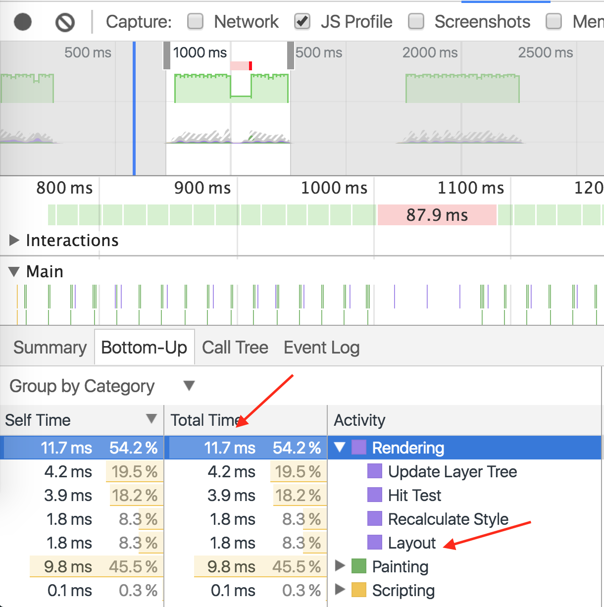
別
使用 left 和 top 觸釋出局動畫。
#box {
  left: 0;
  top: 0;
  transition: left 0.5s, top 0.5s;
  position: absolute;
  width: 50px;
  height: 50px;
  background-color: gray;
}

#box.active {
  left: 100px;
  top: 100px;
}
演示需要 11.7 毫秒渲染, 9.8 毫秒繪畫
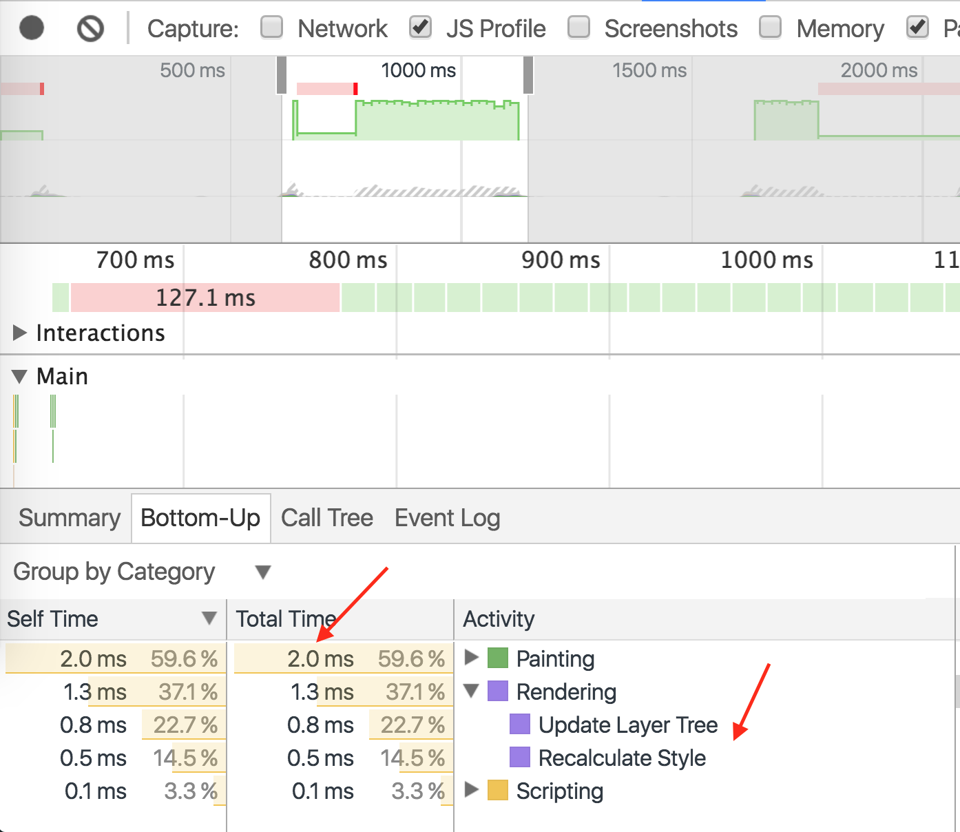
做
使用相同的動畫使用 transform 進行動畫處理。
#box {
  left: 0;
  top: 0;
  position: absolute;
  width: 50px;
  height: 50px;
  background-color: gray;

  transition: transform 0.5s;
  transform: translate3d(0, 0, 0);
}

#box.active {
  transform: translate3d(100px, 100px, 0);
}
演示相同的動畫,渲染時間為 1.3ms ,繪畫時間為 2.0ms 。