有媒體查詢
你可以在媒體查詢中重新設定變數,並將這些新值在任何使用它們的位置級聯,這是前處理器變數無法實現的。
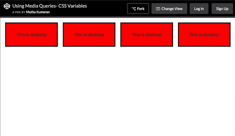
這裡,媒體查詢更改用於設定非常簡單網格的變數:
HTML
<div></div>
<div></div>
<div></div>
<div></div>
CSS
:root{
    --width: 25%;
    --content: 'This is desktop';
}
@media only screen and (max-width: 767px){
    :root{
        --width:50%;
        --content: 'This is mobile';
    }
}
@media only screen and (max-width: 480px){
    :root{
        --width:100%;
    }
}

div{
    width: calc(var(--width) - 20px);
    height: 100px;
}
div:before{
    content: var(--content);
}

/* Other Styles */
body {
    padding: 10px;
}

div{
    display: flex;
    align-items: center;
    justify-content: center;
    font-weight:bold;
    float:left;
    margin: 10px;
    border: 4px solid black;
    background: red;
}
你可以嘗試在此 CodePen 演示中調整視窗大小
以下是調整大小的動畫螢幕截圖: