246 带有 Clearfixes 的布局
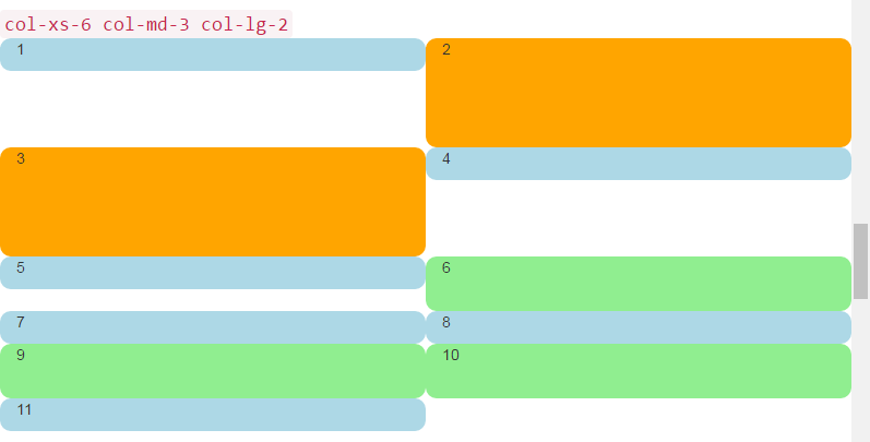
这是一个根据屏幕大小呈现两个,四个或六个单元格的布局。
<div class="container-fluid">
    <div class="row">
        <div class="col-xs-6 col-md-3 col-lg-2">1</div>
        <div class="col-xs-6 col-md-3 col-lg-2 cell-tall">2</div>
        <!--
            On small and extra small devices, the viewport will render TWO cells
            (12 / 6 = 2), so we need a clearfix every TWO cells. We also need to
            say "don't show this clearfix when the viewport will render FOUR cells",
            which it will do at medium size (12 / 3 = 4). We do that by adding
            hidden-md and hidden-lg to our clearfix div, in effect instructing the
            browser to not show it at all on a wider screen.
        -->
        <div class="clearfix hidden-md hidden-lg"></div>
        <!---->
        <div class="col-xs-6 col-md-3 col-lg-2 cell-tall">3</div>
        <div class="col-xs-6 col-md-3 col-lg-2">4</div>
        <!--
            After the FOURTH cell, we need a clearfix, but it still needs to be
            hidden on LARGE viewports, because remember we will have a maximum of
            SIX cells now.
        -->
        <div class="clearfix hidden-lg"></div>
        <!---->
        <div class="col-xs-6 col-md-3 col-lg-2">5</div>
        <div class="col-xs-6 col-md-3 col-lg-2 cell-med">6</div>
        <!--
            After the SIXTH cell, we need to show on SMALL and LARGE, but not on
            MEDIUM. Remember, our MEDIUM viewport only wants a clearfix when we
            are at a multiple of FOUR.
        -->
        <div class="clearfix hidden-md"></div>
        <!---->
        <div class="col-xs-6 col-md-3 col-lg-2">7</div>
        <div class="col-xs-6 col-md-3 col-lg-2">8</div>
        <!--
            Now we have rendered EIGHT cells, which is a multiple of TWO AND FOUR,
            so we put in a clearfix that's not visible on LARGE, because we are NOT
            at a multiple of SIX.
        -->
        <div class="clearfix hidden-lg"></div>
        <!---->
        <div class="col-xs-6 col-md-3 col-lg-2 cell-med">9</div>
        <div class="col-xs-6 col-md-3 col-lg-2 cell-med">10</div>
        <!--
            After the 10th cell, small only.
        -->
        <div class="clearfix hidden-md hidden-lg"></div>
        <!---->
        <div class="col-xs-6 col-md-3 col-lg-2">11</div>
    </div>
</div>
大屏幕: 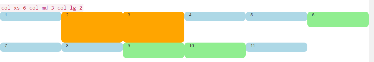 中屏:
中屏: 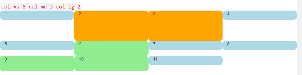 小屏幕:
小屏幕: