立方体
此示例显示如何使用伪元素上的 2D 变换方法 skewX() 和 skewY() 创建多维数据集。
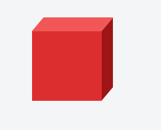
HTML:
<div class="cube"></div>
CSS:
.cube {
  background: #dc2e2e;
  width: 100px;
  height: 100px;
  position: relative;
  margin: 50px;
}

.cube::before {
  content: '';
  display: inline-block;
  background: #f15757;
  width: 100px;
  height: 20px;
  transform: skewX(-40deg);
  position: absolute;
  top: -20px;
  left: 8px;
}

.cube::after {
  content: '';
  display: inline-block;
  background: #9e1515;
  width: 16px;
  height: 100px;
  transform: skewY(-50deg);
  position: absolute;
  top: -10px;
  left: 100%;
}