边界半径
border-radius 属性允许你更改基本框模型的形状。
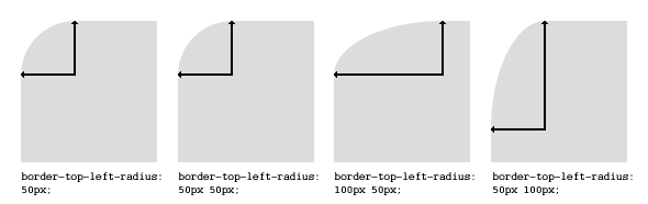
对于该角的垂直和水平半径,元素的每个角最多可以有两个值(最多 8 个值)。
第一组值定义水平半径。可选的第二组值(以“/”开头)定义垂直半径。如果仅提供一组值,则它用于垂直和水平半径。
border-radius: 10px 5% / 20px 25em 30px 35em;
10px 是左上角和右下角的水平半径。5%是左上角和左下角的水平半径。 ‘/‘后面的其他四个值是左上角,右上角,右下角和左下角的垂直半径。
与许多 CSS 属性一样,shorthands 可用于任何或所有可能的值。因此,你可以指定从 1 到 8 的任何值。以下简写允许你将每个角的水平和垂直半径设置为相同的值:
HTML:
<div class='box'></div>
CSS:
.box {
    width: 250px;
    height: 250px;
    background-color: black;
    border-radius: 10px;
}
Border-radius 最常用于将 box 元素转换为圆形。通过将 border-radius 设置为方形元素长度的一半,将创建一个圆形元素:
.circle {
    width: 200px;
    height: 200px;
    border-radius: 100px;
}
由于 border-radius 接受百分比,因此通常使用 50%来避免手动计算 border-radius 值:
.circle {
    width: 150px;
    height: 150px;
    border-radius: 50%;
}
如果 width 和 height 属性不相等,则生成的形状将是椭圆形而不是圆形。
浏览器特定的 border-radius 示例:
  -webkit-border-top-right-radius: 4px;
  -webkit-border-bottom-right-radius: 4px;
  -webkit-border-bottom-left-radius: 0;
  -webkit-border-top-left-radius: 0;
  -moz-border-radius-topright: 4px;
  -moz-border-radius-bottomright: 4px;
  -moz-border-radius-bottomleft: 0;
  -moz-border-radius-topleft: 0;
  border-top-right-radius: 4px;
  border-bottom-right-radius: 4px;
  border-bottom-left-radius: 0;
  border-top-left-radius: 0;